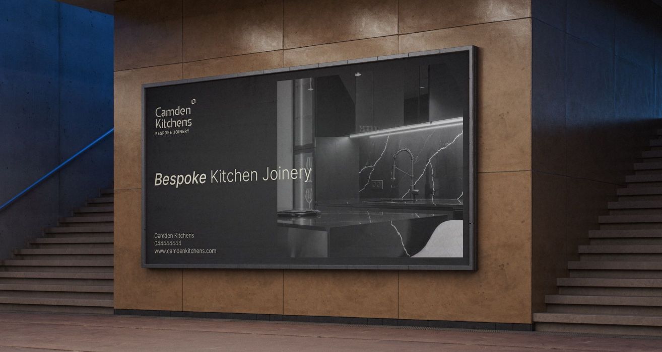
Camden Kitchens is a bespoke kitchen joinery service delivering premium, tailored solutions for homeowners. They approached us to rebrand their business to better reflect their craftsmanship, attention to detail, and value-for-money approach. With a client base primarily made up of women, the goal was to create a brand that felt elegant, approachable, and aspirational.
Feature image on AAF
The work we did
Project Overview
Camden Kitchens is a bespoke kitchen joinery service delivering premium, tailored solutions for homeowners. They approached us to rebrand their business to better reflect their craftsmanship, attention to detail, and value-for-money approach. With a client base primarily made up of women, the goal was to create a brand that felt elegant, approachable, and aspirational.
Challenges
The existing brand was outdated and didn’t fully convey the premium, bespoke nature of Camden Kitchens’ work. It also caused confusion with other businesses, making it harder to stand out. Competitors had stronger branding, giving them the advantage of attracting customers.
Aims and Goals
- Position Camden Kitchens as a premium, bespoke kitchen service
- Appeal to their target audience of mainly female homeowners
- Convey value-for-money without appearing mass-market
- Reflect craftsmanship, care, and professionalism in every touchpoint
Scope of Work
Service
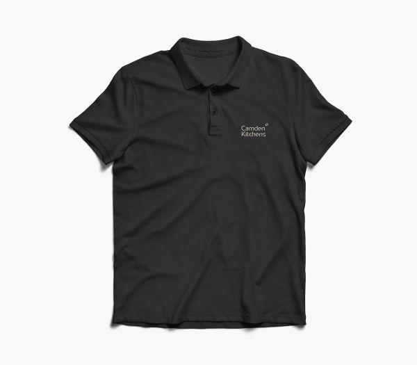
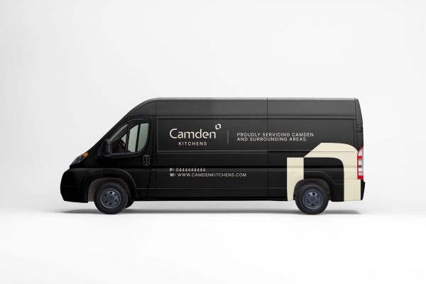
- Brand identity design
- Colour palette and typography selection
- Logo refinement and visual system
Platforms Used
Built on Silverstripe CMS with a custom-developed events system tailored for the Centre’s needs.
Special Features and Integrations
- Custom visual elements inspired by kitchen design and craftsmanship
- Thoughtful typography hierarchy to create elegance and approachability
Process
Our Approach to the Project
We began with a discovery session to understand the business, their audience, and their aspirations. Research and mood boards informed a visual direction that balanced premium sophistication with warmth and approachability.
The brand identity was developed to communicate quality, reliability, and a bespoke approach. Every element from the logo and colour palette to typography and supporting graphics was designed to feel considered and relevant to Camden Kitchens’ audience.
Outcome
The new brand identity positions Camden Kitchens as a premium, client-focused kitchen joinery service. It reflects the quality of their craftsmanship while remaining inviting and accessible, particularly to their primary audience of women.
Key Outcomes:
- Elegant, premium visual identity
- A brand system that appeals to the target audience
- Clear communication of value-for-money and craftsmanship
- Flexible guidelines for digital and print applications
- Stronger alignment between brand perception and business values
Content on Column Layout on Camden Kitchens
Content on Column Layout on Camden Kitchens
Related Projects
Want to chat about a project of your own?
We can't wait to hear from you.